
캐글 자전거 수요예측
아래코드는 학습데이터와 테스트 데이터를 받는 코드이다. 그래서 학습데이터 5개만 출력한 결과이다.
train=pd.read_csv(r'../input/train.csv')
test=pd.read_csv(r'../input/test.csv')
df=train.copy()
test_df=test.copy()
df.head()
df.columns.unique()데이터의 타입은 int8개 object는 1개 float64는 3개 입니다.
df.info()위코드는 결측치를 출력한 코드입니다.
df.isnull().sum()그래서 결측치를 시각화하면 다음과 같습니다.
msno.matrix(df)
데이터를 전부 확인 해보았다.
이제 본격적으로시각화를 해보겠다.
계절
season이라는 변수는 계절을 알리는 편수이다.
1,2,3,4 순서대로
봄,여름,가을,겨울이다
# let us consider season.
df.season.value_counts()
아래는 계절을 시각화한 코드이다.
대략적으로 비슷한것을 확인 할 수있다.
sns.factorplot(x='season',data=df,kind='count',size=5,aspect=1.5)
아래는 holiday라는 컬럼을 세어낸 코드이다.
holiday라는 컬럼은 공유일인지 간주되는 여부로 1인경우만 공휴일이다.
#holiday
df.holiday.value_counts()
sns.factorplot(x='holiday',data=df,kind='count',size=5,aspect=1) # majority of data is for non holiday days.
workingday라는 컬럼은 그날이 공휴일이 아닌날을 의미한다.
1인경우가 평일중에 공휴일이 아닌경우이며
0인경우가 주말을 포함한 공휴일을 의미한다.
df.workingday.value_counts()
sns.factorplot(x='workingday',data=df,kind='count',size=5,aspect=1) # majority of data is for working days.
아래는 날씨를 의미하는 것이다.
1인경우 맑은
2인경우 조금흐림
3인 경우 비또는 눈옴
4인경우는 폭우,폭설입니다.
df.weather.value_counts()
그래서 날씨에 따른 통계를 시각화를 하였습니다.
결과는 다음과 같습니다.
sns.factorplot(x='weather',data=df,kind='count',size=5,aspect=1)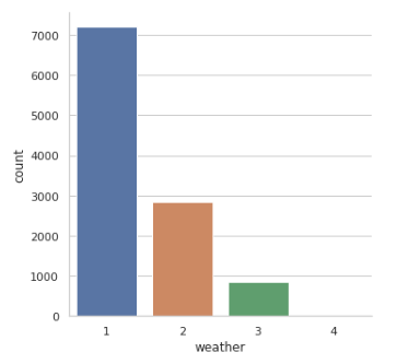
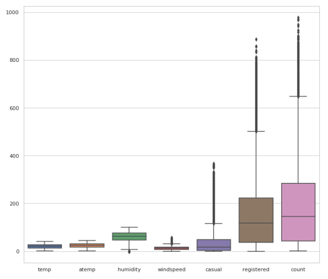
이제 각컬럼의 통계를출력하는 코드입니다.
df.describe()

각자의 통계를 시각화하는 코드이다.
# just to visualize.
sns.boxplot(data=df[['temp',
       'atemp', 'humidity', 'windspeed', 'casual', 'registered', 'count']])
fig=plt.gcf()
fig.set_size_inches(10,10)
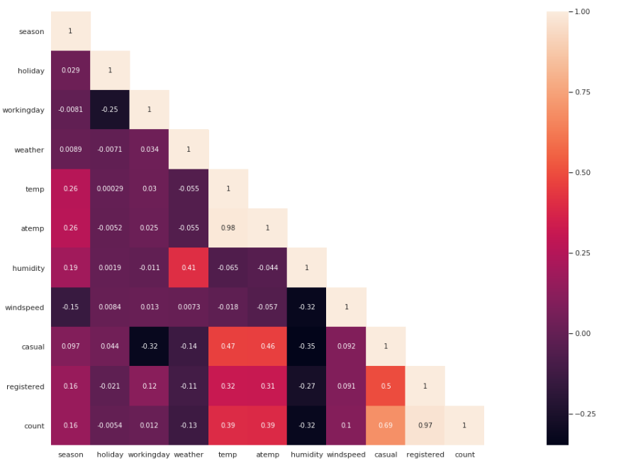
상관관계분석을 시각화를 실행하는 코드이다.
결론부터 말하자면 본인과의 상관관계는 높게 나온다.
두번째로 temp와 atemp와의 상관관계 또한 높게 나온다.
습도인humid와 count는 반비례합니다.
습할수록 자전거를 더안탄다는 의미입니다.
세번째로 casual과 workingday또한 반비례관계입니다.
평상복을 알리는 casual이라는 변수이기에 일하는 날일 수록 평상복을 입는 경우의수가 적어진다는 의미입니다.
네번째로 holiday인경우에 count와 반비례하는 관계를 가집니다.
휴일인 경우에 자전거를 타는 사람이 적다는 것을 의미합니다.
다섯번쨰로 temp와 atemp는 자전거 수요에 영향을 크게 미칩니다.
여섯번쨰로 날씨와 수요에는 반비례관계이다.
비가 내리거나 눈이 더 심하게 올수록 수요는 줄어들었다는 의미입니다.
일곱번째로 registered/casual라는 컬럼은 수요와 상관관계가 높게 나타납니다.
평상복인채로 등록을 자주한다는 의미이기도하며 등록을 한날이라면 수요가 증가했다는 의미이기도 합니다.
#corelation matrix.
cor_mat= df[:].corr()
mask = np.array(cor_mat)
mask[np.tril_indices_from(mask)] = False
fig=plt.gcf()
fig.set_size_inches(30,12)
sns.heatmap(data=cor_mat,mask=mask,square=True,annot=True,cbar=True)
이제 전처리를 시작하겠습니다.
첫번째로 계절을 알려주는 season 컬럼을 원핫 인코딩하겠습니다.
이러면 1,2,3,4로 계절이 불리됩니다.
# # seperating season as per values. this is bcoz this will enhance features.
season=pd.get_dummies(df['season'],prefix='season')
df=pd.concat([df,season],axis=1)
df.head()
season=pd.get_dummies(test_df['season'],prefix='season')
test_df=pd.concat([test_df,season],axis=1)
test_df.head()
weather이라는 컬럼또한 원핫 인코딩하겠습니다.
# # # same for weather. this is bcoz this will enhance features.
weather=pd.get_dummies(df['weather'],prefix='weather')
df=pd.concat([df,weather],axis=1)
df.head()
weather=pd.get_dummies(test_df['weather'],prefix='weather')
test_df=pd.concat([test_df,weather],axis=1)
이제 첫번째 컬럼이 없더라도 봄인지 아닌지 알수있으며 날씨가 비가 오지않는 다면 맑다는 것을 알 수있으므로 첫번째 열은 제거 합니다.
# # # now can drop weather and season.
df.drop(['season','weather'],inplace=True,axis=1)
df.head()
test_df.drop(['season','weather'],inplace=True,axis=1)
test_df.head()


# # # also I dont prefer both registered and casual but for ow just let them both.
이제 년도와 날짜 달을 구분하는 컬럼을 만들어 줍니다.
아래 오른쪽과 같이 컬럼이 생성 되었습니다.
df["hour"] = [t.hour for t in pd.DatetimeIndex(df.datetime)]
df["day"] = [t.dayofweek for t in pd.DatetimeIndex(df.datetime)]
df["month"] = [t.month for t in pd.DatetimeIndex(df.datetime)]
df['year'] = [t.year for t in pd.DatetimeIndex(df.datetime)]
df['year'] = df['year'].map({2011:0, 2012:1})
df.head()
테스트 데이터또한 시간 날짜등을 구분해줍니다.
test_df["hour"] = [t.hour for t in pd.DatetimeIndex(test_df.datetime)]
test_df["day"] = [t.dayofweek for t in pd.DatetimeIndex(test_df.datetime)]
test_df["month"] = [t.month for t in pd.DatetimeIndex(test_df.datetime)]
test_df['year'] = [t.year for t in pd.DatetimeIndex(test_df.datetime)]
test_df['year'] = test_df['year'].map({2011:0, 2012:1})
시간을 구분하는 컬럼을 만들었기에 datetime컬럼을 제거합니다.
# now can drop datetime column.
df.drop('datetime',axis=1,inplace=True)
df.head()
또다시 상관관계 분석을 시작합니다.
cor_mat= df[:].corr()
mask = np.array(cor_mat)
mask[np.tril_indices_from(mask)] = False
fig=plt.gcf()
fig.set_size_inches(30,12)
sns.heatmap(data=cor_mat,mask=mask,square=True,annot=True,cbar=True)
예측이 필요없는 두컬럼은 제거함
df.drop(['casual','registered'],axis=1,inplace=True)시간에 따른 수요
sns.factorplot(x="hour",y="count",data=df,kind='bar',size=5,aspect=1.5)
달에 따른 수요예측
sns.factorplot(x="month",y="count",data=df,kind='bar',size=5,aspect=1.5)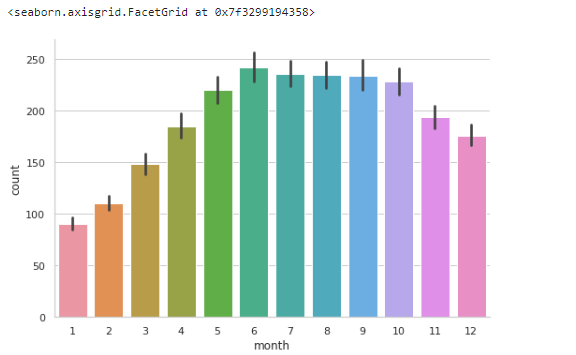
연도에 따른 수요예측
sns.factorplot(x="year",y="count",data=df,kind='bar',size=5,aspect=1.5)
날짜에 따른 수요예측
sns.factorplot(x="day",y='count',kind='bar',data=df,size=5,aspect=1)
각컬럼의 타입을 적기
df.columns.to_series().groupby(df.dtypes).groups

학습할 데이터 나누기
x_train,x_test,y_train,y_test=train_test_split(df.drop('count',axis=1),df['count'],test_size=0.25,random_state=42)
학습할 모델 선정하기
models=[RandomForestRegressor(),AdaBoostRegressor(),BaggingRegressor(),SVR(),KNeighborsRegressor()]
model_names=['RandomForestRegressor','AdaBoostRegressor','BaggingRegressor','SVR','KNeighborsRegressor']
rmsle=[]
d={}
for model in range (len(models)):
    clf=models[model]
    clf.fit(x_train,y_train)
    test_pred=clf.predict(x_test)
    rmsle.append(np.sqrt(mean_squared_log_error(test_pred,y_test)))
d={'Modelling Algo':model_names,'RMSLE':rmsle}
d
예측결과 데이터프레임으로 만들어서 가져오기
rmsle_frame=pd.DataFrame(d)
rmsle_frame

막대그래프로 시각화 하기
sns.factorplot(y='Modelling Algo',x='RMSLE',data=rmsle_frame,kind='bar',size=5,aspect=2)
꺽은선 그래프로 시각화 하기
sns.factorplot(x='Modelling Algo',y='RMSLE',data=rmsle_frame,kind='point',size=5,aspect=2)

KNN알고리즘을 사용하여 예측하기
# for KNN
n_neighbors=[]
for i in range (0,50,5):
    if(i!=0):
        n_neighbors.append(i)
params_dict={'n_neighbors':n_neighbors,'n_jobs':[-1]}
clf_knn=GridSearchCV(estimator=KNeighborsRegressor(),param_grid=params_dict,scoring='neg_mean_squared_log_error')
clf_knn.fit(x_train,y_train)
pred=clf_knn.predict(x_test)
print((np.sqrt(mean_squared_log_error(pred,y_test))))
예측결과 제출
pred=clf_rf.predict(test_df.drop('datetime',axis=1))
d={'datetime':test['datetime'],'count':pred}
ans=pd.DataFrame(d)
ans.to_csv('answer.csv',index=False) # saving to a csv file for predictions on kaggle.